Monday 12 January 2015

Oxblood, claret, vino, Marsala is reigning high

I am following on from our pantone colour special - Marsala. Flashes of this rich and luxurious are everywhere - fashion, interiors, food presentation - you name it and the industry is embracing it!

Harpers Bazzar lead the trail recently with a Golden Globes prediction in this stunning setting with this Erdem dress for Rosamund Pike

BAZAAR predicts which celebrities will be wearing what for January's Golden Globes.

and the celebrities were all over the trend at the Golden Globes tonight.....
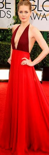

Amy Adams
(image from Eonline.com)


Hosts Tina Fey and Amy Poehler
(image care of nypost.com)


Hosts Tina Fey (love her!) Amy Poehler
(image care of smh.com.au)


Red has always been a sign of boldness and marsala plays on this in a subdued way. I have seen it work beautifully and timelessly as a feature or a back up in many interiors and I am loving it! Enjoy

Pantone's 2015 Color of the Year | Tempo da Delicadeza . . #halls . . #entrance . . #foyer

this is one of my favourites - i love the gloss paint - it adds a touch of glam and modern relevancy 

This is Happening: Out of Africa // three-legged wooden drum stool

Burgundy couch with blue walls #pantone color of the year 2015 | #marsala Suggestion by http://bykoket.com/home.php

how good jammed up against this dusty blue..

♔ Marsala Pantone colour of 2015

stunning old bricks doing the job perfectly. i love the clash of romantic boho with the raw brick work

20x20 burgundy ikat burgundy maroon ikat maroon cushion by SilkWay, $27.69

ikat cushion available on etsy

AGAhuis.nl Rood Wit Blauw. De AGA die in elke keuken past. 60 cm breed, vier pitten, twee ovens!  Een feest voor iedere keuken......

aga are jumping in too with their new release of the small oven.

Wine Convertible....

we love a good car at Stamp!


Wednesday 7 January 2015

Stamp Stylist Sophie Gunnersen featured on the Design Files

We adored meeting Lucy the day she came to photograph Soph's South Melbourne Terrace for her inspiring Blog - the Design Files. We have captured the article below and some of the stunning images of Soph's house.

Enjoy!


http://thedesignfiles.net/2015/01/sophie-and-andrew-gunnersen/

all images and article taken from the design files


Tuesday 6 January 2015

Forecast and trends for 2015 - COLOUR using Pantone

Everyone loves to be in the know about what the next big thing is and at Stamp we love watching new products and colours cross our desks and pouring over what is going to be a hit. I love the inspiration that comes with new fashions and trends but the longer I am in the industry the more I want to share with everyone how we can use these trends in our homes without creating short term interior decoration and design mistakes.

One of our new years resolutions at Stamp in 2015 is to help you navigate this increasingly confusing market place that is overflowing with micro trends and quick fixes so that you are able to create homes and spaces that will make you happy for years to come.

Marsala is the Pantone colour of the year for 2015. As the Pantone colour of the year it hasn't been picked exclusively for Interiors but all aspects of life - car colour choices, fashion, branding and marketing angles just to name a few! 


This is a beautiful colour that will add a touch of sophistication to any room. It's been called Marsala after its name sake - a good glass of red vino. yum.

 At Stamp we love that the old and rigid colour rules have been all but thrown out the window (when was the last time you heard not to put navy next to black?) and a new creative flow is reigning high. At Stamp we are always placing similar hues side by side and the best way to do this is to use TEXTURE - leather mashed up with against linen, felt, metallics, wool-  I could go on and on but I will save that for another day! I would love for example to put a bit of Marsala next to a vibrant red; doing this updates older items and adds a bit of edge and confidence to your scheme.

I have focussed on two colour palates below that would make timeless and beautiful schemes that are relevant and easy to live with. 


We love the earthy set of colours above it is timeless but still very relevant as is the scheme below which focuses more on the neutrals. These colour boards that can be spread through a house enabling you to constantly mix up your pieces to create new looks (We are yet to come across a client who doesn't go a bit stale with the same arrangements season in and out year after year...) just by pulling bits of furniture and pieces in and out of different rooms and voila - change can be as good as a holiday! We would throw Marsala in with either of these schemes with ease. It doesn't have to be a big statement - a coffee table book or flowers are an affordable way to update the colour of any scheme. 


Each of these palates are quite muted but still have personality and a hook. Australian Interiors and home-wares have been very much about pastel for the last couple of years and for us at Stamp it has become a bit of an overload. We are looking into a new direction that isn't based around the 'in' colours but will let us slip them in if needed!

Enjoy!