Monday, 12 January 2015

Oxblood, claret, vino, Marsala is reigning high

I am following on from our pantone colour special - Marsala. Flashes of this rich and luxurious are everywhere - fashion, interiors, food presentation - you name it and the industry is embracing it!

Harpers Bazzar lead the trail recently with a Golden Globes prediction in this stunning setting with this Erdem dress for Rosamund Pike

BAZAAR predicts which celebrities will be wearing what for January's Golden Globes.

and the celebrities were all over the trend at the Golden Globes tonight.....


Amy Adams
(image from Eonline.com)


Hosts Tina Fey and Amy Poehler
(image care of nypost.com)


Hosts Tina Fey (love her!) Amy Poehler
(image care of smh.com.au)


Red has always been a sign of boldness and marsala plays on this in a subdued way. I have seen it work beautifully and timelessly as a feature or a back up in many interiors and I am loving it! Enjoy

Pantone's 2015 Color of the Year | Tempo da Delicadeza . . #halls . . #entrance . . #foyer

this is one of my favourites - i love the gloss paint - it adds a touch of glam and modern relevancy 

This is Happening: Out of Africa // three-legged wooden drum stool

Burgundy couch with blue walls #pantone color of the year 2015 | #marsala Suggestion by http://bykoket.com/home.php

how good jammed up against this dusty blue..

♔ Marsala Pantone colour of 2015

stunning old bricks doing the job perfectly. i love the clash of romantic boho with the raw brick work

20x20 burgundy ikat burgundy maroon ikat maroon cushion by SilkWay, $27.69

ikat cushion available on etsy

AGAhuis.nl Rood Wit Blauw. De AGA die in elke keuken past. 60 cm breed, vier pitten, twee ovens!  Een feest voor iedere keuken......

aga are jumping in too with their new release of the small oven.

Wine Convertible....

we love a good car at Stamp!


Wednesday, 7 January 2015

Stamp Stylist Sophie Gunnersen featured on the Design Files

We adored meeting Lucy the day she came to photograph Soph's South Melbourne Terrace for her inspiring Blog - the Design Files. We have captured the article below and some of the stunning images of Soph's house.

Enjoy!


http://thedesignfiles.net/2015/01/sophie-and-andrew-gunnersen/

all images and article taken from the design files


Tuesday, 6 January 2015

Forecast and trends for 2015 - COLOUR using Pantone

Everyone loves to be in the know about what the next big thing is and at Stamp we love watching new products and colours cross our desks and pouring over what is going to be a hit. I love the inspiration that comes with new fashions and trends but the longer I am in the industry the more I want to share with everyone how we can use these trends in our homes without creating short term interior decoration and design mistakes.

One of our new years resolutions at Stamp in 2015 is to help you navigate this increasingly confusing market place that is overflowing with micro trends and quick fixes so that you are able to create homes and spaces that will make you happy for years to come.

Marsala is the Pantone colour of the year for 2015. As the Pantone colour of the year it hasn't been picked exclusively for Interiors but all aspects of life - car colour choices, fashion, branding and marketing angles just to name a few! 


This is a beautiful colour that will add a touch of sophistication to any room. It's been called Marsala after its name sake - a good glass of red vino. yum.

 At Stamp we love that the old and rigid colour rules have been all but thrown out the window (when was the last time you heard not to put navy next to black?) and a new creative flow is reigning high. At Stamp we are always placing similar hues side by side and the best way to do this is to use TEXTURE - leather mashed up with against linen, felt, metallics, wool-  I could go on and on but I will save that for another day! I would love for example to put a bit of Marsala next to a vibrant red; doing this updates older items and adds a bit of edge and confidence to your scheme.

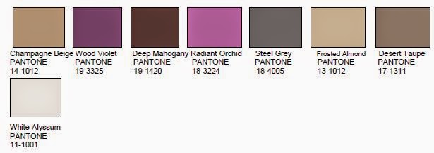
I have focussed on two colour palates below that would make timeless and beautiful schemes that are relevant and easy to live with. 


We love the earthy set of colours above it is timeless but still very relevant as is the scheme below which focuses more on the neutrals. These colour boards that can be spread through a house enabling you to constantly mix up your pieces to create new looks (We are yet to come across a client who doesn't go a bit stale with the same arrangements season in and out year after year...) just by pulling bits of furniture and pieces in and out of different rooms and voila - change can be as good as a holiday! We would throw Marsala in with either of these schemes with ease. It doesn't have to be a big statement - a coffee table book or flowers are an affordable way to update the colour of any scheme. 


Each of these palates are quite muted but still have personality and a hook. Australian Interiors and home-wares have been very much about pastel for the last couple of years and for us at Stamp it has become a bit of an overload. We are looking into a new direction that isn't based around the 'in' colours but will let us slip them in if needed!

Enjoy!


Friday, 22 August 2014

Marlene Birger's new london home

at stamp we are massive advocates of colour and lots of it! however when marlene birger's new pad in london crossed our desks we had to share it with you. many monochrome interiors come across a bit stiff and uptight, however marlene's, clever use of texture has created a beautiful home where a spilt glass of wine won't get you de-friended on facebook. we love it


we love the different linens used here


these blinds are throughout the house. they remind us of one of her linen dresses or shirts. 

Birger's move to london from Majorca coincides with the launch of her new brand Birger1962 which has just opened its first showroom in copenhagen. we are excited.


Thursday, 14 August 2014

Temporary Pleasures a pop up by arabella ramsay, le louvre, stamp interiors and cou cou baby

come and join us for a glass of bubbles and a quick shop at this fabulous fusion pop up. grab a frock, a bit of cashmere for the bambino or a cushion to recline on and gloat over your beautiful new finds!sorry no rain checks!

Tonight: 252 High St Prahran


Sunday, 1 June 2014

can you afford not to use an interior designer?


we took the below article from our friends over at interiors addict:

Ali Ross says using an interior designer can actually cost you less than doing it yourself
As a design professional with over a decade of experience here in Australia and the US, one of my biggest learnings relates to the value a designer can add. You may not need an architect to run your project but consider using an interior designer for these reasons:
1. We add value through considered space planning, maximising the potential of a space in terms of flow and function and the level of comfort through thoughtful detailing. In other words, we get it right and we get it right the first time.
On a recent project, I was called on to help improve the flow and function of an entry, hall and lounge room. By simply filling in an oversized opening off the entry and recommending a new glazed door in a new location, it opened up a whole new way for the client to arrange and use the space. It was an obvious solution to me, but one that had been overlooked by the client. Now they actually enjoy using the space!
2. As professionals, we have the skills, experience and foresight to identify and solve problems and make the right decisions as they arise (or before) quickly and confidently. We take control of what can otherwise be a stressful process. Whether it’s selecting the appropriate tap spout length to suit a basin, establishing the perfect position for a power point to work in with a furniture plan or simply selecting a suitable size sofa or rug for a space, all of these small decisions impact the end result.
3. We have relationships with reputable trades and suppliers who we trust to deliver good services and products.
On a few occasions, I have been brought in to correct or ‘make good’ mistakes that have been made, with joinery in particular. One client had allowed a joiner to make some design-related decisions but the result was far from well resolved. In fact, they could hardly access one part of the wardrobe, the hardware that had been selected was cheap and the sliding doors were so thin they shook and shuddered along the tracks. When they decided to have new joinery built for another location, they didn’t hesitate to contact me.
4. Designers have access to trade pricing on all local and international furniture and this ranges from 10%-to-25% off retail. I pass on this trade pricing to my clients.
To give you an example, I recently completed a job where I provided a combination of bespoke joinery and furniture selections. The furniture purchases made for part of the home came to approximately $18,000. A trade discount ranging from 10%-to-20% was passed on to them, offering a saving of over $2,500. My fees for this part of the job were around $2,000, an amountmore than covered by the savings on the furniture.
When you consider these figures and facts – can you really afford not to use an interior designer?

Thursday, 17 October 2013

ikea limited edition ranges - Fjalltag

We all love a bit of ikea (see our black and white carpet post!) and they have come up trumps with the sometimes irritating issue of product over exposure. Ikea have launched some limited edition ranges for the Northern Hemisphere fall/winter season and we think they are fab!

 IKEA FJÄLLTÅG limited edition collection, winter 2012-2013. Designer: Lycke von Schantz


The IKEA FJÄLLTÅG limited edition collection, winter 2012-2013. Designer: Lycke von Schantz

IKEA lanceert limited edition NÄTVIDE collectie  Rijke prints, etnische invloeden en prachtige kleuren. Met NÄTVIDE - de nieuwe limited edition textielcollectie van IKEA – breng je eenvoudig warmte en sfeer in huis. http://wonenonline.blogspot.nl/2012/08/ikea-lanceert-limited-edition-natvide.html


The IKEA FJÄLLTÅG limited edition collection, winter 2012-2013. Designer: Lycke von Schantz

Discover IKEA's limited edition FJÄLLTÅG range


limited edition rugs from ikea

love this Ikea hack!

#ikea #stampinteriors 

Wednesday, 2 October 2013

to revamp or not ?!


Many would say reupholster... what do you think? we love it!

seat

Monday, 23 September 2013

the old black and white rug - the staple faithful!

While I tend to ere on the side of anonymity when it comes to decorating - i can think of nothing worse than people walking into a house and asking if you got the chairs at Space, the vase at temple and webster etc. I like a little surprise and a bit more of a unique aspect that isn't necessarily readily there on the High Street in its masses straight out of China.

Saying this - I am amazed at how frequently this Ikea rug does a good job under so many circumstances. Available world wide and probably sitting under something on every corner, it manages to always lift a scheme and add a certain cheekiness to a room.

Slesin/Steinberg Apartment | New York Social Diary #GISSLER #interiordesign


black and white striped rug and a live edge table!


Black lacquer furniture, a beautifully arranged set of antique prints, a few golden accessories and a black and white striped rug... I will never get tired of it.


black and white stripe rug


black and white striped rug


A


In the dining room: Navy walls, a vintage-style brass pendant light and a black and white striped rug come together here for a crisp, modern look. One red chair in the corner and an eclectic mix of art on the wall give this space a quirky edge.  Wall paint: Almost Black, Benjamin Moore


Stockholm Vitt - Interior Design


Already got the fur, just need the chair...


Black and white striped rug.

#ikea, #stampinteriors

Sunday, 22 September 2013

key investment pieces - the dining table

At Stamp one of the most common reasons that Clients come to us is because they are having troubles deciding on their big items. They have been living with the Uni/ post Uni or hand me down furniture for some time and they are looking to make the move to an object that screams 'them' and will make them pleased as punch for years to come.

The two major players are style and functionality. You will hate it if either of these criteria's are not met head on, and be back in the market for a newy within the year. We guarantee it!

 Today we thought we would show you some dining tables that have met both of these criteria's for some of our clients. A big thing to look for when choosing your next table is to be wary of the legs. Often Clients come to us with existing chairs and their eye on a new table and they are looking for reassurance before making the plunge. However the first thing we see is that their beautiful over sized wishbone chairs are not going to work with inverted splayed legs either when a poor dinner guest has to wrap their pins around a leg or a chair sits out awkwardly when not in use.

for more information on any of these tables please contact Stamp Interiors................


beautiful elegant pins - but be wary with your chairs


i love a bit of concrete to take out the 'nice' in a dining space!


a timeless number that will always work in many environments


who doesn't love a good goss at a round table?!


another beauty that works beautifully as an oversized desk as well


Thursday, 22 August 2013

scouting for great stuff

i am often scouting the big www for beautiful pieces for clients. In my searches I often come across the most beautiful pieces that makes me want to swap my terrace house in Melbourne for a castle in Romania just to fill the rooms up. Some of the bits are so reasonable that it seems rude not to snap the up, others make me find myself wondering which to sell first - car, kidney or child.....

Laverne

this Laverne 'chan' dining table comes in at a cool US $22,000

Togo Leather Chair And Ottoman Michel Ducaroy for Ligne Roset
Togo leather chair and ottoman by Michel Ducaroy for Ligne Roset


Lidded Box by Wilhelm Kage

Wilheim Kage lidded box

George Nakashima
George Nakashima free edge wall mounted desk and chair

WWI Belgian-Made Flag with 16 Stripes
WW1 Belgian made USA Flag


Pair of Vintage Orange and White Murano Lamps by Barbini

Murano lamps by Barbini

Jorgen Hovelskov, one of 8 circle chairs, 1976

Jorgen Hovelskov chair


Pair of Small Bird Decanters 
decanters - LOVE!!

Crouching Figuer by Carmelo Zotti
Carmelo Zotti crouching figure


actually just one room, somewhere, and they can all go in it together!